The Company
Johnnie Byrd Brewing is Nebraska’s first benefit corporation brewery, and the fifth overall benefit corporation in Nebraska. Alongside craft beer, Greg purchased a still to begin distilling spirits. Their offerings vary from whiskeys, vodka, gin, and honeyshine, and now spiced rum.
The Project
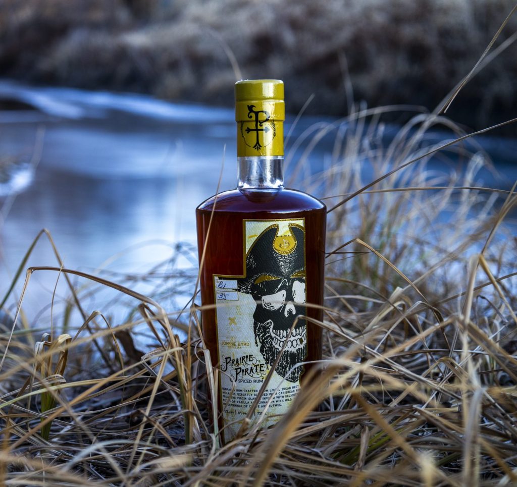
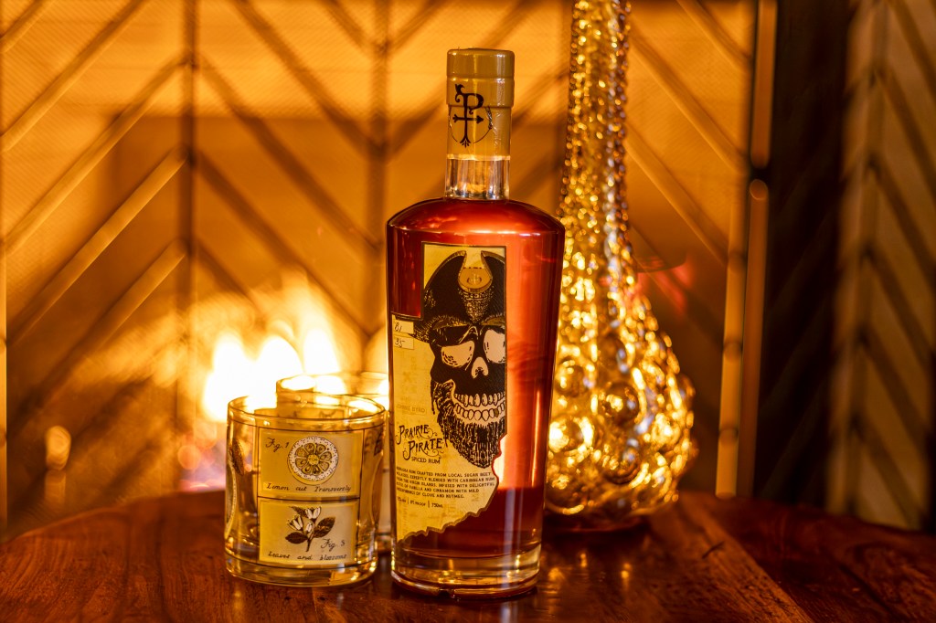
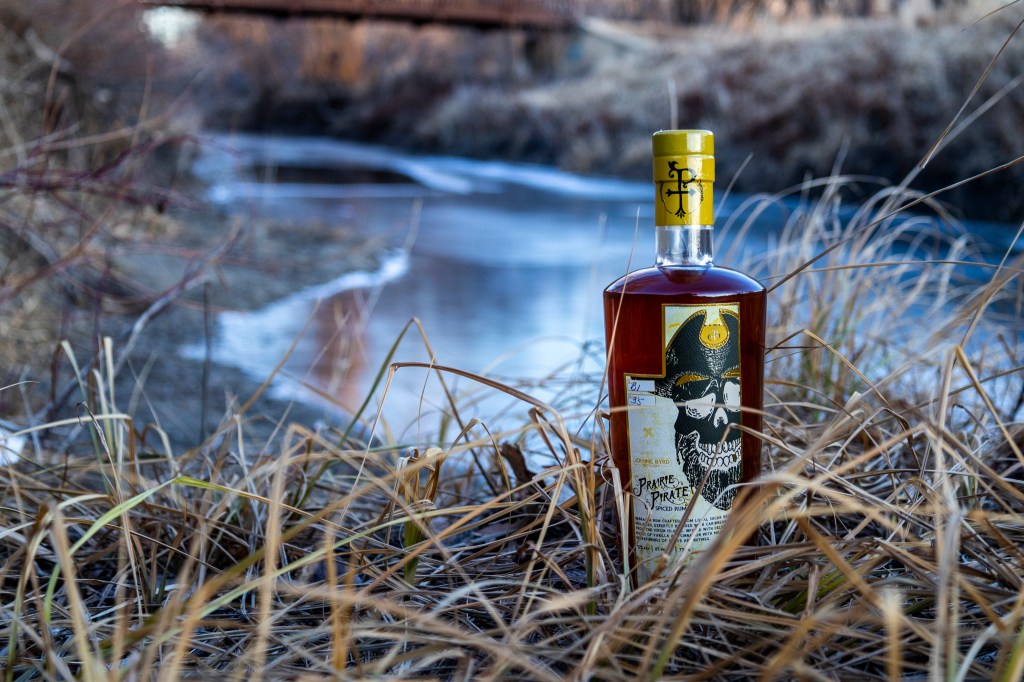
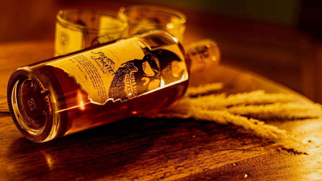
A custom logo, typography, and illustrations were developed to give this unique brand its signature style. The design is inspired by regional characteristics of Nebraska, and the Midwest at large. Several expressions and hat choices were offered for the idea of a rotating label design.


Ultimately, the curious eyebrow was chosen. To stay in line with the designs of the other spirits, the label is die cut in the shape of the state of Nebraska. Arranging the label vertically allow ample space to create a focal point on the skull, with the logo and description as secondary elements. Greg wanted the focus of the label to be the skull, something that people recognize without the logo. A map of the state of Nebraska with a dotted trail ending in an “X” serves as a treasure map to the brewery’s location, Wayne, Nebraska.
The final design touch was the addition of gold foiling, replacing the brand’s signature yellow. This elevated the label with a premium feel, enhancing the rich character of the spiced rum. Explore the gallery below showcasing the finished product in all its detail.